top of page


Selected Work
From Vision to Elevated Brand Presence
Heart2Heart Wellness
Overview
Heart2Heart Wellness began as a vision. we transformed it into a clear,
credible brand through strategy, mission and vision development,
identity design, and a fully custom web experience.
The Approach
This project focused on transformation — taking a heartfelt concept
and building a structured, refined digital presence that feels
intentional, calm, and complete.
Strategy
Defined the brand’s direction, messaging, mission, and vision creating a foundation rooted in clarity and purpose.
Identity
Developed the logo, visual tone, and overall brand presence
to reflect trust, warmth, and professionalism.
Execution
Designed and built a custom website experience that translates
seamlessly across desktop and mobile.
Every element was built to align the vision with structure — creating a brand that not only connects, but stands with credibility.

Selected Work
Refining Identity. Elevating Presence.
RISE Foundation
Overview
The RISE Foundation logo refresh focused on elevating an already meaningful concept into a more refined and impactful brand mark. The goal was not to redesign, but to strengthen — preserving the symbolism while improving clarity, structure, and overall presence.
The Challenge
The original identity carried strong symbolism — growth, royalty, legacy, and cultural pride. However, its execution felt flatter and less resolved, limiting its visual impact. The challenge was to retain the meaning while enhancing hierarchy, balance, and overall polish.
The Approach
We approached the refresh by identifying what was already working conceptually and rebuilding the visual system with more intention. The tree, crown, and typography remained central, but were refined to create a more cohesive, structured, and elevated identity.
Clarity
Refined the structure to improve readability, balance, and overall visual hierarchy.
Depth
Introduced dimensionality and stronger detailing to elevate the mark beyond a flat execution.
Presence
Strengthened typography and icon integration to create a more confident, unified brand mark.
Final Result
The updated logo transforms the brand from a strong concept into a more complete and credible identity. It now communicates growth, strength, and legacy with greater clarity and visual authority.
A meaningful concept, refined into a stronger visual identity with depth, clarity, and presence.
Selected Work
From Concept to Cohesive Identity
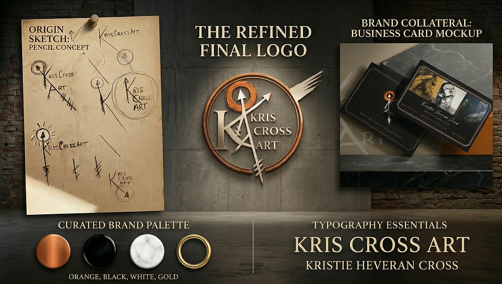
KrisCross Art
Overview
KrisCross Art began with a hand-drawn logo concept and a strong body of original artwork. we translated that vision into a refined identity system—elevating the logo, developing branded collateral, and shaping the overall presentation into something cohesive, expressive, and market-ready without losing the artist’s original voice.
The Goal
The objective was not to replace the concept, but to elevate it. The identity needed to preserve the raw, hand-drawn energy while becoming more structured, legible, and usable as a professional brand asset. The supporting materials also needed to extend the brand into a more complete and presentable system.
The Approach
We treated the original sketch as the foundation of the brand rather than something to redesign entirely. The refinement focused on improving structure, clarity, and balance while maintaining the authenticity of the original mark. From there, We extended the identity into business card design to create a unified and recognizable brand presence.
Refinement
Strengthened the structure and legibility of the original sketch while preserving its character.
Cohesion
Extended the identity into branded collateral, ensuring consistency across touch points.
Expression
Maintained the artist’s voice by integrating original artwork into the brand presentation.
Brand Direction
The final direction balances raw creativity with refined presentation. The orange, black, and white palette creates energy and contrast, while gold accents introduce a more elevated finish. The result is expressive enough for an artist brand, but structured enough to function in a professional and promotional space.
Final Result
The outcome is a stronger, more cohesive artist identity built from the client’s original vision. The refined logo carries more clarity and presence, while the business card system transforms into a functional brand asset that supports both recognition and marketing.
A raw concept, refined into a cohesive identity that balances expression with structure.

Selected Work
From Biography to a PAC Leadership Platform
The Honorable Winsome Earle-Sears
Overview
This project began with a minimal professional bio that captured only a fraction of Winsome Earle-Sears’s story. We transformed that limited starting point into a fully developed digital experience—one that presents her as a leader, public servant, woman of faith, author, and the driving force behind WinsomePAC.
The Goal
The objective was to expand a minimal narrative into a complete and credible story without losing professionalism. The site needed to reflect the full scope of her life—military service, family, faith, resilience, public leadership, and community impact—while positioning WinsomePAC as a natural extension of that legacy.
The Approach
We approached the project through research and narrative structure. Rather than relying solely on the original bio, We built a layered content system that reveals different dimensions of identity and leadership. Each section was intentionally sequenced to guide the viewer through her story with clarity, depth, and purpose.
Narrative
Expanded a limited bio into a complete, structured leadership story.
Positioning
Reframed her identity beyond title—presenting her as a multidimensional leader.
Continuity
Connected WinsomePAC as an extension of legacy, not a separate entity.
Brand Direction
The visual direction is clean, editorial, and authoritative. Strong typography, controlled spacing, and structured layouts create a balance between institutional credibility and personal presence. The result feels polished and official, while still grounded in humanity and story.
Final Result
The final website functions as both biography and strategic repositioning. It honors her past, clarifies her present, and introduces her future-facing leadership with greater depth and intention—transforming a simple bio into a complete digital platform.
A limited narrative transformed into a structured leadership platform with clarity, depth, and purpose.
bottom of page